1,825 members 👥 from 1,283 unique funds 💸 across 151 different cities 🌎
Venture is an access game.
The better your levels of access, the better you can play the game.

98% of websites suck.
Vague copy + boilerplate design = boring results
Here are ten ways (and examples) you can stand out from the pack and convert more traffic.
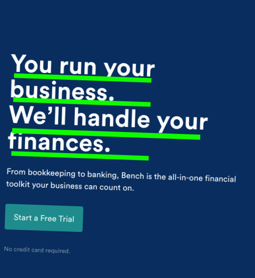
Dumb down your copy. Business jargon is the worst. Nobody cares about how complex your solution is. Focus on what is important, and communicate that through copy. Try writing like you talk, and see what happens.

Ponds > oceans. "Don't boil the ocean" is one of the most-overused phrases in life, but it holds true. If you market for everybody, you market for nobody. Understand your ideal customer, and craft your message specifically to them. More niche = higher conversions
Focus on pain. People respond emotionally to pain (especially if they can resonate with it). Describe painful situations that your ideal customer can relate to using words, images, or videos. This is the hook that makes them more receptive to your offer.

Solution > features. "Nobody cares what you can do; everybody cares about what you can do for them." Highlighting everything you do will never win you over somebody new. Labeling you can specifically do for that person to make their life better will.

Focus on your Unique Selling Proposition (USP). Everybody pitches how they're different, but very few communicate it on their homepage.
When a new ideal customer reaches your site for the first time, you've already done 90% of the hard work. What makes them choose to engage with you once they get there?
One goal. You should have a clear goal for new visitors that come to your website. That could be to sign up for your newsletter, download a lead magnet, book a demo, or anything else you like.
Only include ONE call-to-action. Anything more than this will lead to analysis paralysis and the visitor taking no intended actions.

Proof. People buy from people. Sprinkle in social proof above and below the fold to increase conversions. This could be testimonials, case studies, or five-star reviews - whatever you think shows off what you do best.

Level up your CTA. Adding only one CTA is a given, but you should do more to encourage clicking on this button. Give more context to why a user should click in, and sprinkle it through the landing page.
A “Sign up Now” button doesn't give a reason to do that action. You need to add some context around it.
How long is the free trial? What is the real cost? How easy is it to set up? All of these will result in higher conversions than bland CTAs.
Test and optimize. This is straightforward, but you should always be testing. Setup tracking events/goals, and follow it weekly, and change it until you find what converts at the highest clip.
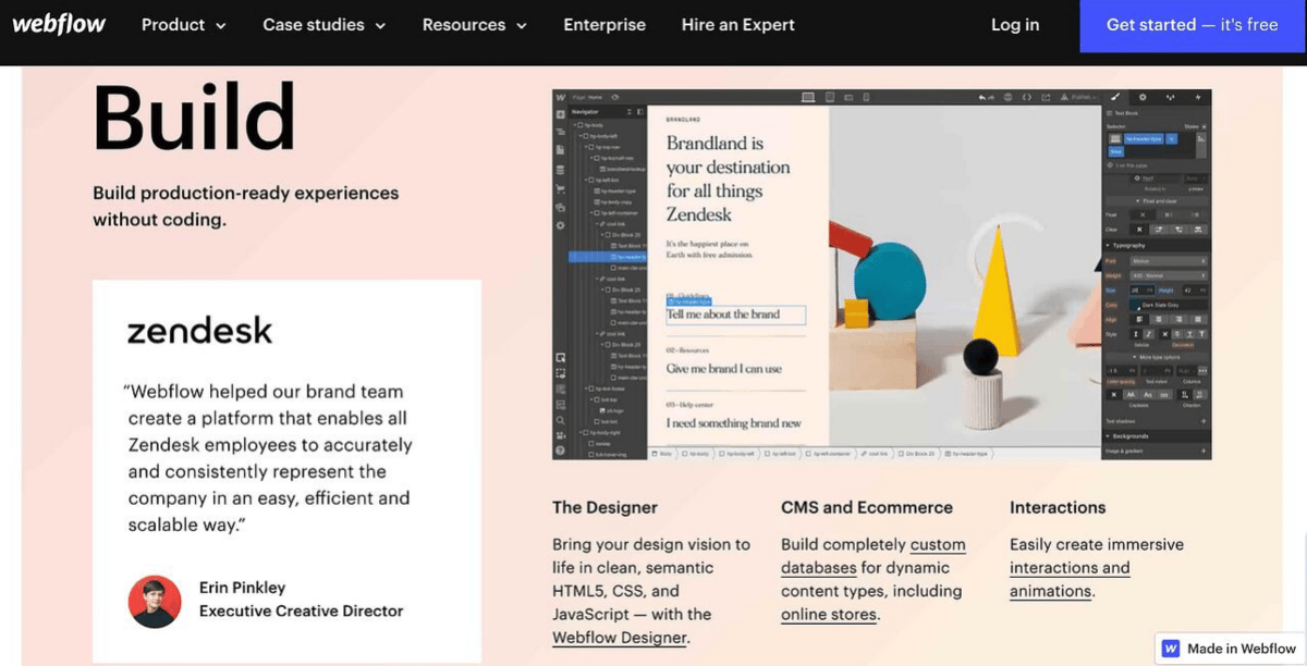
Relevant images. 70% of people consider themselves visual learners. If your landing page is only words, you're automatically appealing to a fraction of visitors. People like product visuals, illustrations, animations, and dashboards to show what you do.

Sponsored by Subcovery
Your churn is not your fault.
Think about that - 1/10 of recurring revenue is at risk because of something preventable.
Doesn't that seem crazy?
Subcovery helps SaaS founders keep their hard-earned subscription revenue by automating their failed payments recovery process. They help you gauge the health of your subscriptions, personalize campaigns, and get live dashboards to see the impact it has on your overall business.
Feel free to unsubscribe whenever this stops becoming valuable to you.
Sign up for our referral program if you want to start getting free stuff by sharing what we're working on.


